Free and Handy Tutoring for Business Students
Welcome to STA 200 tutoring web page.
************************************
Chapter 1: Introduction and Data Collection.
1. Why to learn statistics.
Statistics is the branch of mathematics that transforms numbers into useful information for decision makers.
Statistics provides a way for understanding and then reducing – but not eliminating – the variations that is part of any decision making process, and also can tell you the known risks associated with making a decision.
Statistics provides methods for analyzing the numbers. These methods will help you to find patterns in the numbers and enable you to determine whether differences in the numbers are just due to chance. As you learn these methods you will also learn the appropriate conditions for using them. And because so many statistical methods must be computerized in order to be practical benefit, as you learn statistics you also need to learn about the programs that help apply statistics in the business world.
2. Statistics in the business world.
In the business world, statistics has four important applications:
- To summarize business data.
- To draw conclusion from that data.
- To make reliable forecasts about business activities.
- To improve business process.
The field of statistics consists of two branches:
Descriptive statistics focuses on collecting, summarizing, presenting, and analyzing a set of data.
Inferential statistics uses data that have been collected from a small group to draw conclusions about a larger group.
Looking at the first bulleted point above, descriptive statistics allows you to create different tables and charts to summarize your data. It also provides a statistical measures such as the mean, median, and standard deviation to describe different characteristics of your data.
Drawing conclusion from your data is the heart of inferential statistics. Using these methods enables you to make decision based on data rather than just on intuitions.
Making reliable forecasts involves developing statistical models for prediction. These models enable you to develop more accurate prediction of future activities.
Improving business process involves using managerial approaches that focuses on quality improvement such as SIX SIGMA. These approaches are data driven and use statistical methods as n integral part of the quality improvement approach.
3. Basic Vocabulary of Statistics.
A variable is a characteristic of an item or an individual. When used in everyday speech, variables suggest that some values changes or varies. These different values are the data associated with a variable, and more simply, the data to be analyzed .
Remember that values are meaningless unless their variables have operational definitions. These definitions are universally accepted meanings that are clear to all associated with an analysis.
A population consists of all the items or individuals about which you want to draw a conclusion.
A sample is the portion of a population selected for an analysis.
A parameter is a numerical measure that describes a characteristic of a population.
A statistic is a numerical measure that describes a characteristic of a sample.
4. Data Collection.
Data sources are classified as being either:
- Primary sources: when the data collector is the one using the data for analysis.
- Secondary sources: when the person performing the statistical analysis is not the data collector.
Sources of data falls into one of four categories.
- Data distributed by an organization or an individual.
- A designed experiment.
- A survey.
- An observational study.
5. Types of Variables.
a. Categorical variables also known as qualitative variables have values that can only be places into categories, such as yes or no.
b.Numerical variables also known as quantitative variables have values that represent quantities.
i. Discrete variables have numerical values that arise from a counting process. Because the answer is one of a finite number of integers.
ii.
Continuous variables produce numerical responses that arise from a
measuring process. Because the response takes on any value within a continuum,
or interval, depending on the precision of the measurement.
Bellow, there is our selection of youtube videos that we hope will help you emphasise the concepts that we covered above.
Contnuous Vs Discret Data
Levels of measurement and measurement scales.
Please have a look at the following link:
http://onlinestatbook.com/index.html
You can also have a look at the following video.
¨
Paratmeter Vs Statistic
Chapter Two: Presenting Data in Tables and
Charts.
Concerning Chapter Two, we decided to not cover it at 100%. What we are going to do instead, is that we will deal with it as a collection of concepts and points.
Each time we judge that an idea is important and needs to be covered, we will post something abou it.
Because our judgement may not match your expectations and needs, we encourage you to contact us on saadbob2@hotmail.com, or to upload your questions on our private forum.
Bar Charts

Bar Charts, like pie charts, are useful for comparing classes or groups of data. In bar charts, a class or group can have a single category of data, or they can be broken down further into multiple categories for greater depth of analysis.
Things to look for:
Bar charts are familiar to most people, and interpreting them depends largely on what information you are looking for. You might look for:
- the tallest bar.
- the shortest bar.
- growth or shrinking of the bars over time.
- one bar relative to another.
- change in bars representing the same category in different
- classes.
Other tips:
- Watch out for inconsistent scales. If you're comparing two or more charts, be sure they use the same scale. If they don't have the same scale, be aware of the differences and how they might trick your eye.
- Be sure that all your classes are equal. For example, don't mix weeks and months, years and half-years, or newly-invented categories with ones that have trails of data behind them.
- Be sure that the interval between classes is consistent. For example, if you want to compare current data that goes month by month to older data that is only available for every six months, either use current data for every six months or show the older data with blanks for the missing months.
Pie Charts

Pie charts are used to show classes or groups of data in proportion to the whole data set. The entire pie represents all the data, while each slice represents a different class or group within the whole.
Things to look for:
- Look for the largest piece to find the most common class.
- Notice relative sizes of pieces. Some classes might be unexpectedly similar or different in size.
- Try looking at a two-dimensional view of the pie; 3D charts are attractive but they can make pieces at the front of the picture look bigger than they really are.
Pareto Charts

Vilfredo Pareto, a turn-of-the-century Italian economist, studied the distributions of wealth in different countries, concluding that a fairly consistent minority – about 20% – of people controlled the large majority – about 80% – of a society's wealth. This same distribution has been observed in other areas and has been termed the Pareto effect.
The Pareto effect even operates in quality improvement: 80% of problems usually stem from 20% of the causes. Pareto charts are used to display the Pareto principle in action, arranging data so that the few vital factors that are causing most of the problems reveal themselves. Concentrating improvement efforts on these few will have a greater impact and be more cost-effective than undirected efforts.
Things to look for:
In most cases, two or three categories will tower above the others. These few categories which account for the bulk of the problem will be the high-impact points on which to focus. If in doubt, follow these guidelines:
- Look for a break point in the cumulative percentage line. This point occurs where the slope of the line begins to flatten out. The factors under the steepest part of the curve are the most important.
- If there is not a fairly clear change in the slope of the line, look for the factors that make up at least 60% of the problem. You can always improve these few, redo the Pareto analysis, and discover the factors that have risen to the top now that the biggest ones have been improved.
- If the bars are all similar sizes or more than half of the categories are needed to make up the needed 60%, try a different breakdown of categories that might be more appropriate.
A Geat tool called EXCEL Makes it easy for you to creat a Pareto Chart.
Enlarge your knowldege.
The Pareto Principle === The 80/20 Rule.
THE Steam and Leaf Display.
Study the following:
http://cnx.org/content/m10157/latest/
when you have a data set that contains a large number of values, reaching conclusions from an ordered array or a steam and leaf display can be difficult. In such circumstances, you need to present data in tables and charts such as the frequency and percentage distributions, histogram, polygon, and cumulative percentage polygone (ogive).
The frequency distribution:
Please have a look at the following link:
http://www.statcan.gc.ca/edu/power-pouvoir/ch8/5214814-eng.htm
Because we know that most of you are not reading lovers, we selected for you some videos that we hope will help you assimilate the concepts discussed above:
The frequency distribution
The Relative Frequency Ditribution
The relative frequency of a class is the frequency of the class divided by the total number of frequencies of the class and is generally expresses as a percentage.
Example: The weight of 100 persons were given as under :
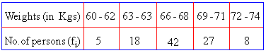
|
|

|
Solution :
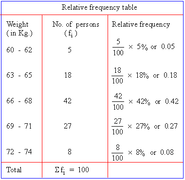
Note : The word frequency of a class means, the number of times the class is repeated in the data or the total number of items or observations of the data belongs to that class.
Use also the following LINK:
http://www.cimt.plymouth.ac.uk/projects/mepres/book7/bk7i21/bk7_21i3.htm
The Relative and the Percentage Frequency distribution.
Cumulative percentage Distribution
The Cumulative Percentage Distribution provides a way of presenting information about the percentage of items that are less than a certain value. The percentage distribution is used to calculate the cumulative percentage distribution.
Statistics with Excel is Magic.
Statistics with Excel is Magic.
Polygon
constructing multiple histogram on the same graph when comparing two or more sets of data is confusing. Superimposing the vertical bars of one histogram on another histogram makes interpretation difficult. When there are two or more groups, you should use a percentage polygon.
A percentage polygon is formed by having the midpoint of each class represent the data in that class and then connecting the sequence of midpoints at their respective class percentages.
Cross Tabulation
The Scatter Plot
Scatter Plot
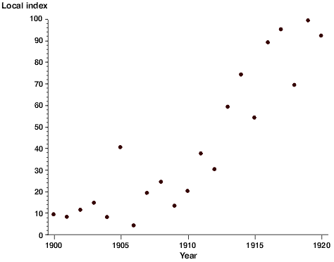
With a scatter plot a mark, usually a dot or small circle, represents a single data point. With one mark (point) for every data point a visual distribution of the data can be seen. Depending on how tightly the points cluster together, you may be able to discern a clear trend in the data.
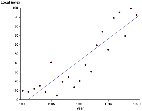
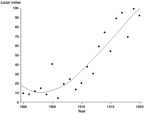
Because the data points represent real data collected in a laboratory setting rather than theoretically calculated values, they will represent all of the error inherent in such a collection process. A regression line can be used to statistically describe the trend of the points in the scatter plot to help tie the data back to a theoretical ideal. This regression line expresses a mathematical relationship between the independent and dependent variable. Depending on the software used to generate the regression line, you may also be given a constant that expresses the 'goodness of fit' of the curve. That is to say, to what degree of certainty can we say this line truly describes the trend in the data. The correlational constant is usually expressed as R2 (R-squared). Whether this regression line should be linear or curved depends on what your hypothesis predicts the relationship is. When a curved line is used, it is typically expressed as either a second order (cubic) or third order (quadratic) curve. Higher order curves may follow the actual data points more closely, but rarely provide a better mathematical description of the relationship.
Chapter Three: Numerical Descriptive
Measures.
Measures of central tendency:
The central tendency is the extent to which all the data values group a typical or central value.
The variation is the amount of dispresion, or scattering, of values away from a central value.
The shape is the pattern of the distribution of values from the lowest value to the highest value.
when people talk about an average value or the middle value or the most frequent value, they are talking informally about the mean, median, and mode - three measures of central tendency.
The mean, median, and mode:
A great video.
If I were you I will watch it.
Variation and Shape:
In addition to central tendency, every data set can be characterized by it's variance and shape. Variation measures the spread, or dispersion, of values in a data set. One simple measure of variation is the range, the difference between the largest and smallest values. More commonly used in statistics are the standard deviation and variance, two measures explained later in this section. The shape of the a data set reperesent a pattern of all the values, from the lowest to the highest value.
The Variance and the standard deviation:
Although the range is a simple measure of variation, it does not take into consideration how the values cluster between the extremes. Two commonly used measures of variation that take into account how all the values inthe data are distributed are:
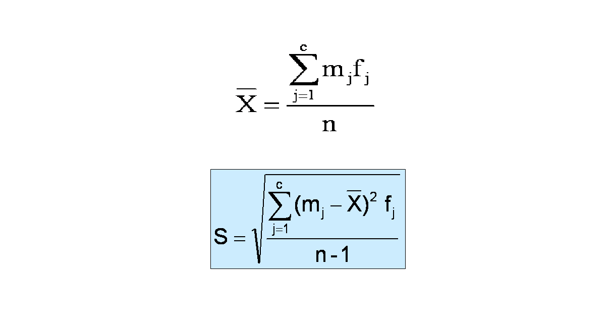
The sample Variance is the sum of the squared differences around the mean devided the sample size minus one.
The sample standard deviation: is the square root of the sum of the squared differences around the mean devided by the sample size minus one.
Reviewing concepts never hurt
Sample Variance
Standard Deviation
Coefficient of Variation
Z - Score.
Hé!! Focus on the Z score, not on something else. I know, I know....
I know it's hard to focus in the first video...... for those who
had problems, please have a look at this second one.
Shape
EMPIRICAL RULE
The Chebyshev Rule
A nice video, that I hope will help you get things clear in your mind. This video is
about the Mean, the Standard deviation, the empirical rule, and the chebyshev
theorem. No formulas, just a nice and meaningful Bla Bla Bla...
Computing Numerical Descriptive measures from a frequency
distribution
Sometimes you have only a frequency distribution, ot the raw data. When this occurs, you can compute approximations to the mean and the standard deviation.
When you have data from a sample that has been summarized into a frequency distribution, you can compute an approximation of the mean by assuming that all the values within each class interval are located at the midpoint of the class.

To calculate the standard deviation from a frequency distribution, you assume that all values within each class interval are located at the midpoint of the class.


Quartiles - Interquartile Range - 5 N° Summary
Box and Whisker Plot
The Coefficient of Correlation
Chapter four: Basic Probability
the principles of probability help bridge the words of descriptive and inferential statistics. Reading this chapter will help you learn about different types of probabilities, how to compute probabilities, and how to revise probabilities in light of new information. Probability principles are the foundation for the probability distribution, the concept of mathematical expectation, and the binomial, hypergeometric, and poisson distributions, topics that are discussed in Chapter 5.
Probability is the numeric value representing the chance, or possibility a particular event will occur.
An event that has no chance of occuring has a probability of 0. An event that is sure to occur has a probability of 1.
There are three types of probability:
- A prior:
The probability that an event will reflect established beliefs about the event before the arrival of new evidence or information. Prior probabilities are the original probabilities of an outcome, which be will updated with new information to create posterior probabilities.

Investopedia Says:
Prior probabilities represent what we originally believed before new evidence is uncovered. New information is used to produce updated probabilities and is a more accurate measure of a potential outcome. For example, three acres of land have the labels A, B and C. One acre has reserves of oil below its surface, while the other two do not. The probability of oil being on acre C is one third, or 0.333. A drilling test is conducted on acre B, and the results indicate that no oil is present at the location. Since acres A and C are the only candidates for oil reserves, the prior probability of 0.333 becomes 0.5, as each acre has one out of two chances. - Empirical: What Does Empirical Probability Mean?
A form of probability that is based on some event occurring, which is calculated using collected empirical evidence. An empirical probability is closely related to the relative frequency in a given probability distribution.Investopedia explains Empirical Probability
In order for a theory to be proved or disproved, empirical evidence must be collected. An empirical study will be performed using actual market data. For example, many empirical studies have been conducted on the capital asset pricing model (CAPM), and the results are slightly mixed.
In some analyses, the model does hold in real world situations, but most studies have disproved the model for projecting returns. Although the model is not completely valid, that is not to say there is no utility associated with using the CAPM. For ins - Subjective:
A subjective probability describes an individual's personal judgement about how likely a particular event is to occur. It is not based on any precise computation but is often a reasonable assessment by a knowledgeable person.
Like all probabilities, a subjective probability is conventionally expressed on a scale from 0 to 1; a rare event has a subjective probability close to 0, a very common event has a subjective probability close to 1.
A person's subjective probability of an event describes his/her degree of belief in the event.
Example
A Rangers supporter might say, "I believe that Rangers have probability of 0.9 of winning the Scottish Premier Division this year since they have been playing really well."
Events and Sample Spaces:
- Event: Each possible outcome of a variable is referred to as an event.
- A simple event: is described by a single characteristic.
- A joint event: is an event that has two or more characterisitics.
- The complement of an event: A includes all events that are not part of A.
- Sample Space: the collection of all possible events is called the sample space.
Contingency Tables:
Please study the following link:
http://www.r.umn.edu/academics/just-ask/math/statistics/probability-contingency-venn-tree/index.htm
Contingency Tables:
Venn diagrams:
The venn diagram == Logic
A more advanced video about the Venn Diagram.
Simple Probability
Joint Probability
Joint probability is the probability of two events in conjunction. That is, it is the probability of both events together. The joint probability of A and B is written P(A, B).
Marginal probability is the probability of one event, ignoring any information about the other event. Marginal probability is obtained by summing (or integrating, more generally) the joint probability over the ignored event. The marginal probability of A is written P(A), and the marginal probability of B is written P(B).
In these definitions, note that there need not be a causal or temporal relation between A and B. A may precede B, or vice versa, or they may happen at the same time. A may cause B, or vice versa, or they may have no causal relation at all.
General Addition Rule
In advanced levels in Mathematics, instead of using ""Or"" we use ""U"" so don't get confused by the notation in the following video
Conditional Probability
Calculating Conditional Probability
If you still need more things about How to Calculate Conditional Probability, Please study the following link:
http://www.zweigmedia.com/RealWorld/tutorialsf3/frames6_5.html
Decision Tress
Independence
To those who are reading lovers and need more ""stuff"" about Conditional Probability and Independence Please study the following Link:
http://www.zweigmedia.com/RealWorld/tutorialsf3/frames6_5C.html
Rule of Multiplication
The rule of multiplication applies to the following situation. We have two events from the same sample space, and we want to know the probability that both events occur.
Example 1
An urn contains 6 red marbles and 4 black marbles. Two marbles are drawn without
replacement from the urn. What is the probability that both of the
marbles are black?
Solution: Let A = the event that the first marble is black; and let B = the event that the second marble is black. We know the following:
- In the beginning, there are 10 marbles in the urn, 4 of which are black. Therefore, P(A) = 4/10.
- After the first selection, there are 9 marbles in the urn, 3 of which are black. Therefore, P(B|A) = 3/9.
Therefore, based on the rule of multiplication:
P(A ∩ B) = (4/10)*(3/9) = 12/90 = 2/15
Example 2
Suppose we repeat the experiment of Example 1; but this time we select marbles with
replacement. That is, we select one marble, note its color, and then
replace it in the urn before making the second selection. When we select with
replacement, what is the probability that both of the marbles are black?
Solution: Let A = the event that the first marble is black; and let B = the event that the second marble is black. We know the following:
- In the beginning, there are 10 marbles in the urn, 4 of which are black. Therefore, P(A) = 4/10.
- After the first selection, we replace the selected marble; so there are still 10 marbles in the urn, 4 of which are black. Therefore, P(B|A) = 4/10.
Therefore, based on the rule of multiplication:
P(A ∩ B) = (4/10)*(4/10) = 16/100 = 4/25
Bayes' Theorem
Please have a look at the following two videos.
Another nice and ""light"" video about the Bayes' Theorem.